
Web Design 101: Typography and how to use it to your advantage.
This article's main objective is to educate you on how to use typography effectively when creating digital media.

My name is Michael. I'm a software developer who enjoys blogging and interacting with others about technology.
My work has been included in a variety of publications, including books and periodicals, and I've contributed to a number of open-source projects.
Prior to designing software, I worked in digital marketing. I envision myself working in the blockchain business for the foreseeable future.
The reason for which something is done or made might be referred to as a purpose.
When making a website, the most important thing to think about is what the site is supposed to do, but many people don't think about it.
A skilled web developer understands that it serves as a road map for all of the work that goes into creating a website.
First impressions are important when developing a website, and within five seconds, the user should know what the website stands for, or in other words, what it offers.
Color, typography, layout, and, most importantly, the content of the website are all influenced by our "mission," which is a good thing to do.
This article's main goal is to teach you how to use typography to your advantage while developing websites and other digital media.
What is Typography?
We'll move on to one of the most crucial aspects of our design careers.
Typography is not something that is innately understood by everyone. When you learn how to do something, you must be willing to do it.
Typography, in its most basic definition, is the style or appearance of text.
Typography is a lot less well-known than it should be, but it is a very good way to get and keep people's attention.
From personal experience, I've discovered that outstanding typography is the single most important factor in keeping me engaged with a product.
Because there is so much rivalry in the business world these days, the best companies aim to take advantage of each moment they can to grab the attention of their target customers and communicate a brand message to them.
Let's discuss the three most commonly seen types of typefaces, as well as how to use them.
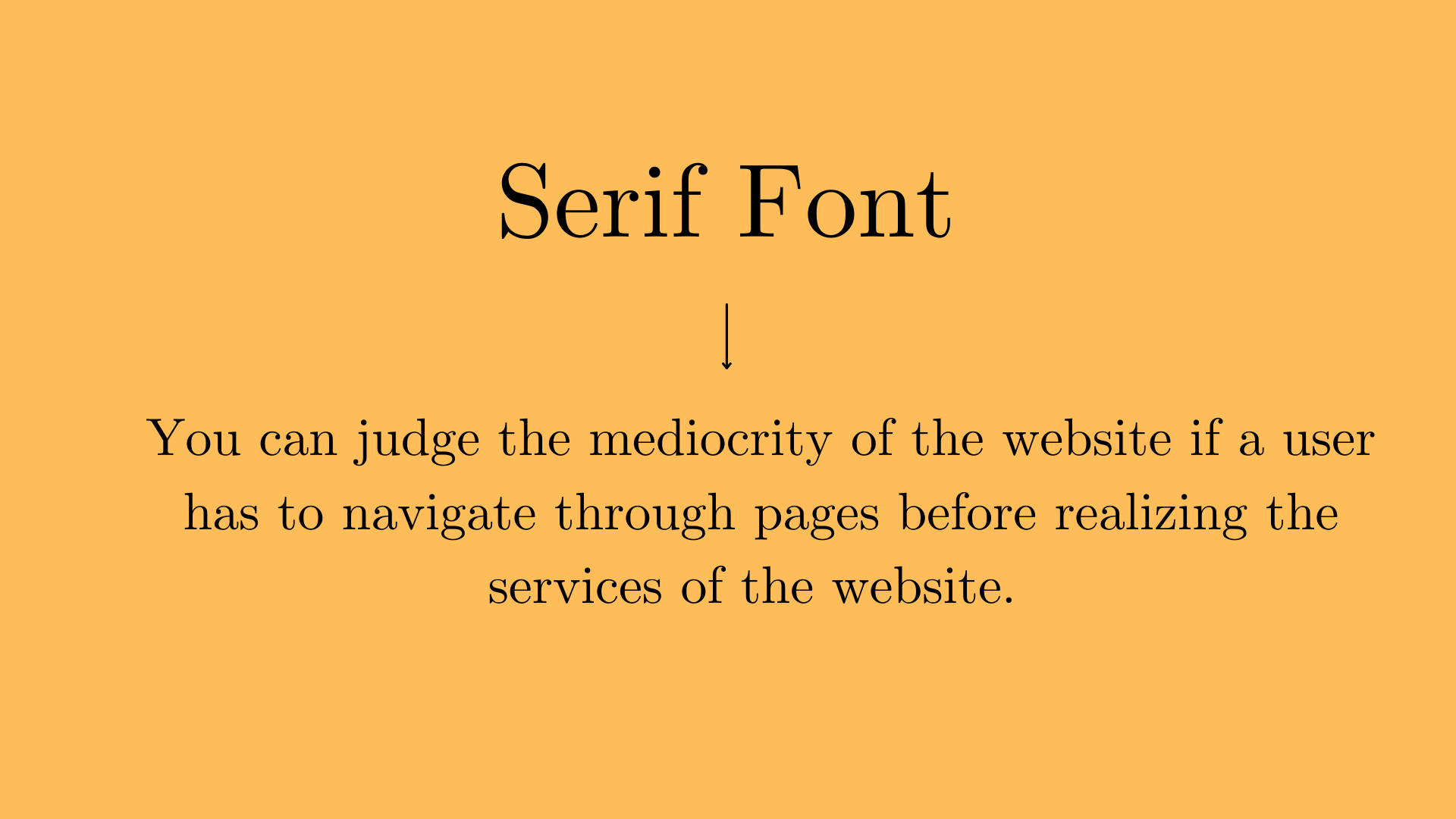
Serif Fonts
Serif typefaces include strokes known as "serifs" that are attached to the main portions and ends of the letter, respectively. They have a traditional appearance and a well-established monetary worth.
They tend to appear more frequently in traditional works and printed publications than in electronic works.
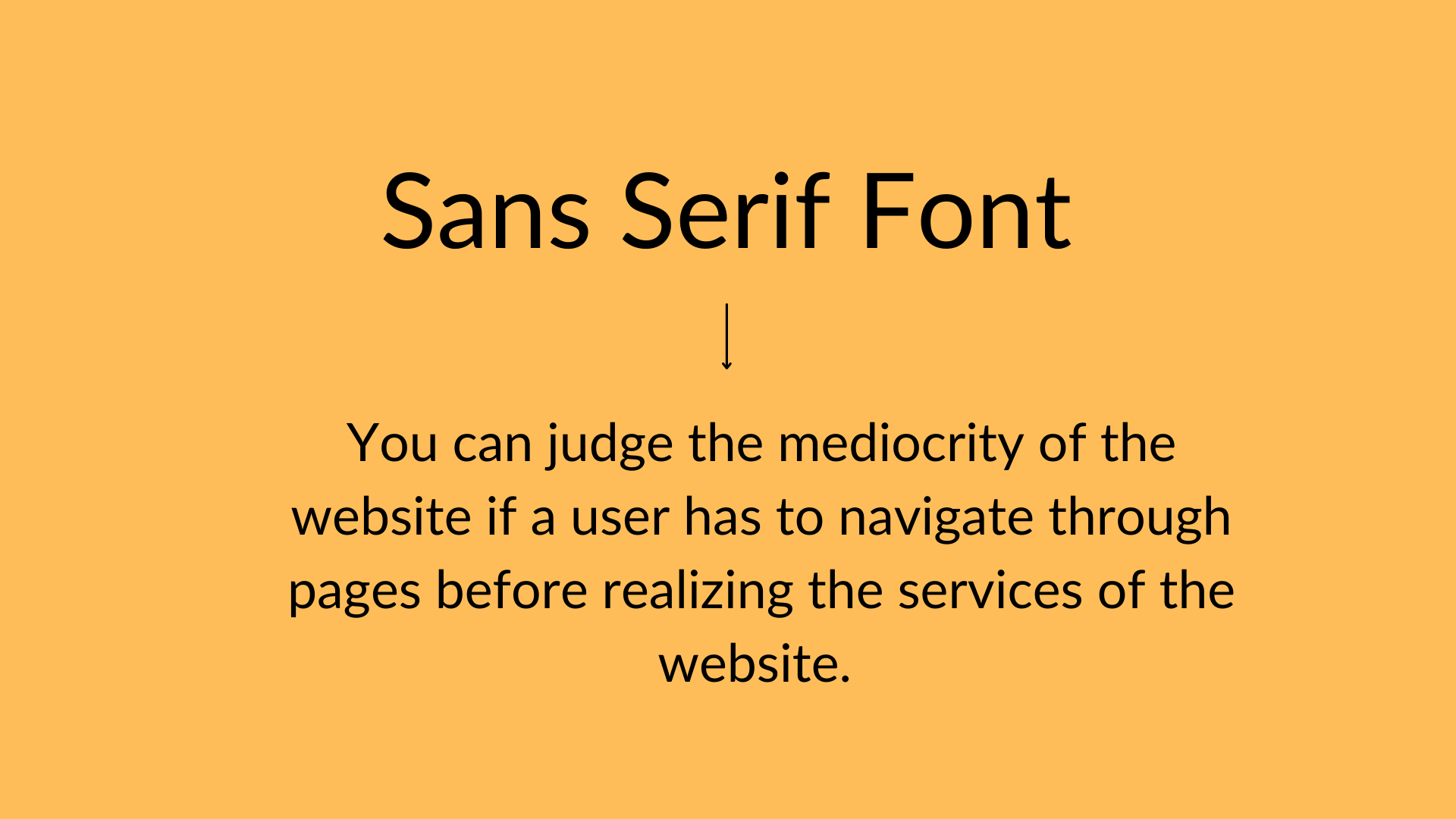
Sans Serif Fonts
"Sans" is a French word that translates as "without." Unlike serif fonts, sans-serif fonts do not have the extra strokes that serif fonts do.
Sans serif typefaces are contemporary and clean, and they are increasingly being used in all types of digital work. One of the reasons for its success is that it is extremely easy to read and is less taxing on the eyes.
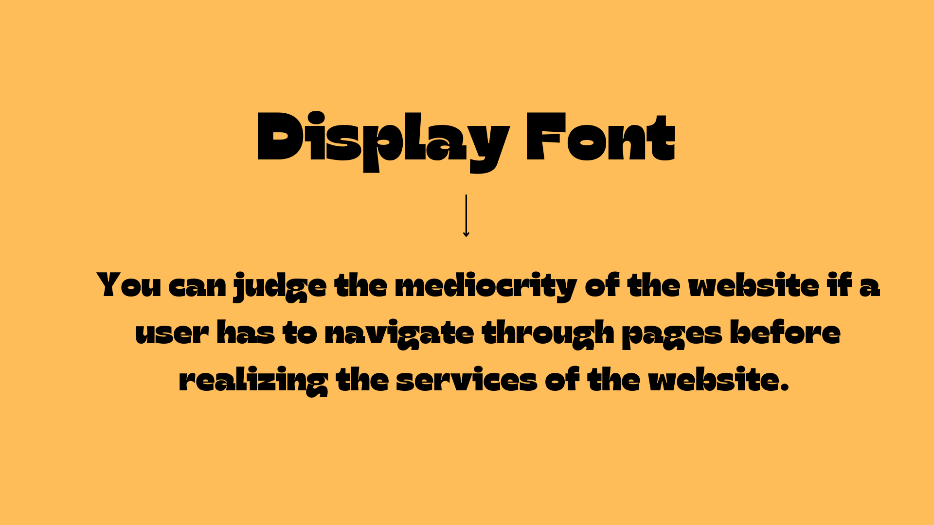
Display Fonts
Display fonts are available in a variety of styles, including scripts, blackletter, and others.
In addition to being beautiful ornamental elements, they function best when used to highlight a small amount of text in the header and title.
Font selection for a project: a step-by-step guide.
Fonts may convey a tremendous deal of information, and they are an excellent tool for communicating with and building trust with your users. Let's take a look at the purpose of websites once more.
It is critical to select a typeface that is appropriate for the message being conveyed. Just as it is with colors, less is more in this case.
When determining which fonts to utilize, it is preferable to stick to one or two per project when making your selection.
It says that "like poles repel each other, and opposite poles attract." This can be found in basic physics.
This is also an intriguing topic when it comes to fonts.
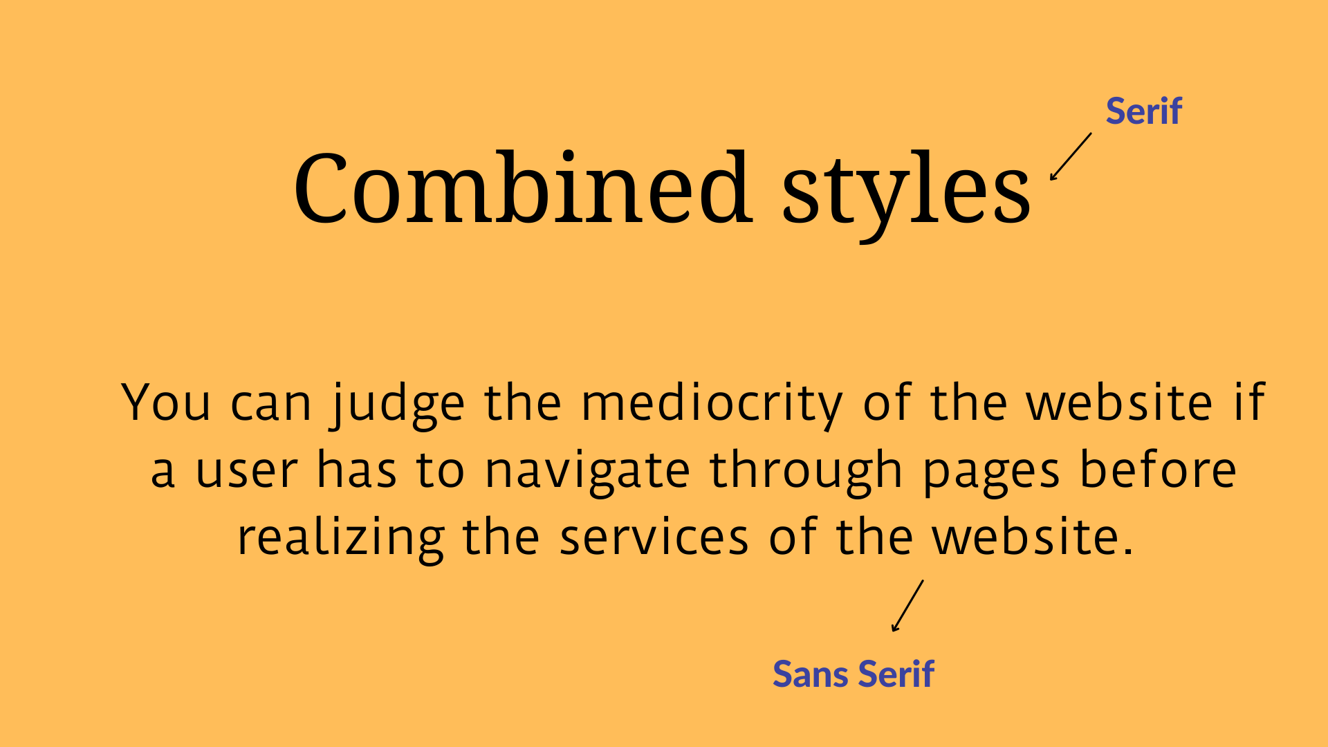
Do not be afraid to blend two styles that are distinct but complementary, such as sans-serif with serif, a short line-height with a long one, or decorative fonts with simple fonts, among other things.
Now, let's take a look at some of the technical issues that have a significant impact on typography.
These concepts are necessary for creating designs that have a professional appearance.
1. Hierarchy
One of the primary goals of this hierarchy is to guide the user through the process of recognizing what is most important, such as where to begin, where to go next, and what comes under what heading.
All of this is accomplished through the use of various types and levels of concentration. It is really simple to create a hierarchical structure.
This can be accomplished by highlighting the elements you want the user to notice and drawing their attention to them. You can use different font sizes, bolding, italics, and even different colors. Make it a priority to keep things as basic as possible.
2. Leading
One thing I like about design principles is that we all know them, no matter what our field of work is.
Line-spacing is something that we learn in basic word documents as part of our computer studies curriculum.
In this case, leading and line spacing are synonymous.
Line spacing is the amount of space that separates each line of text from the one before it.
In most circumstances, changing the line spacing is not a good idea because the default setting is completely acceptable.
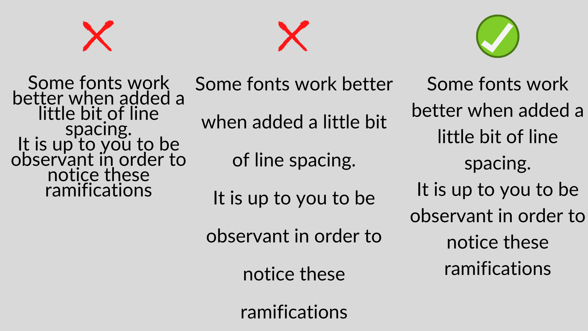
Some typefaces perform better when a small amount of line space is used.
These repercussions will only be noticed by those who are keen observers and a little bit imaginative.
Keep in mind that the goal is to make your content comfortable to read while maintaining a basic appearance.
Too much or too little information might be a source of frustration for the reader.
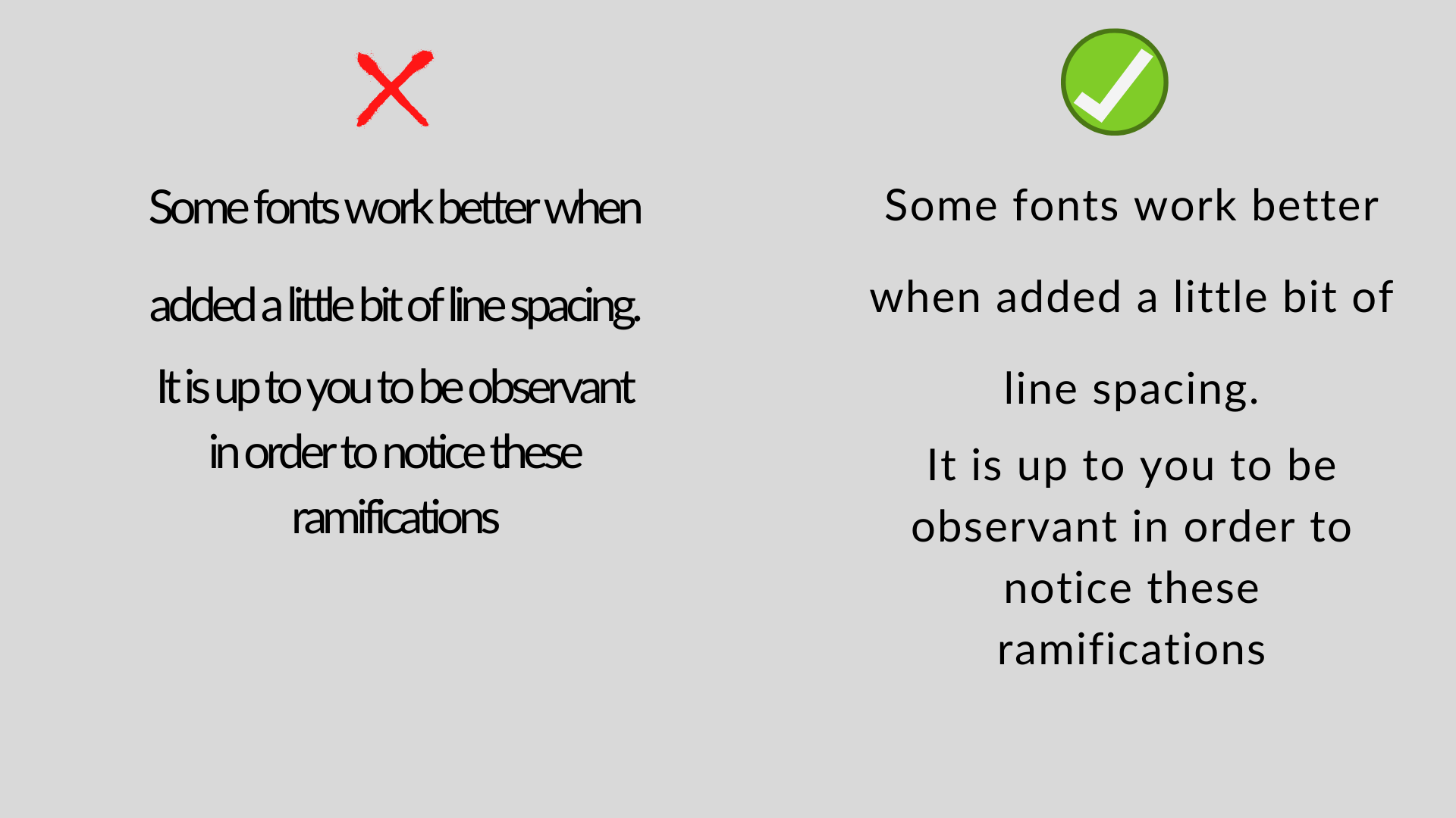
3. Tracking
The term "tracking" refers to the total amount of space between characters (letter-spacing).
It is important not to mix leading with tracking because the former has something to do with lines while the latter has something to do with letters.
Depending on the goal and use of your work, you may choose to condense or expand the characters in it.
Naturally, certain fonts, particularly "display" fonts, have a terrible sense of proportion. Tracking can assist you in resolving this issue.
Conclusion
One can tell the difference between what is normal and what is spectacular based on the typography used.
All it takes to make something great is to think about and follow good rules, as well as to think about the people who will use it and try to make them happy.
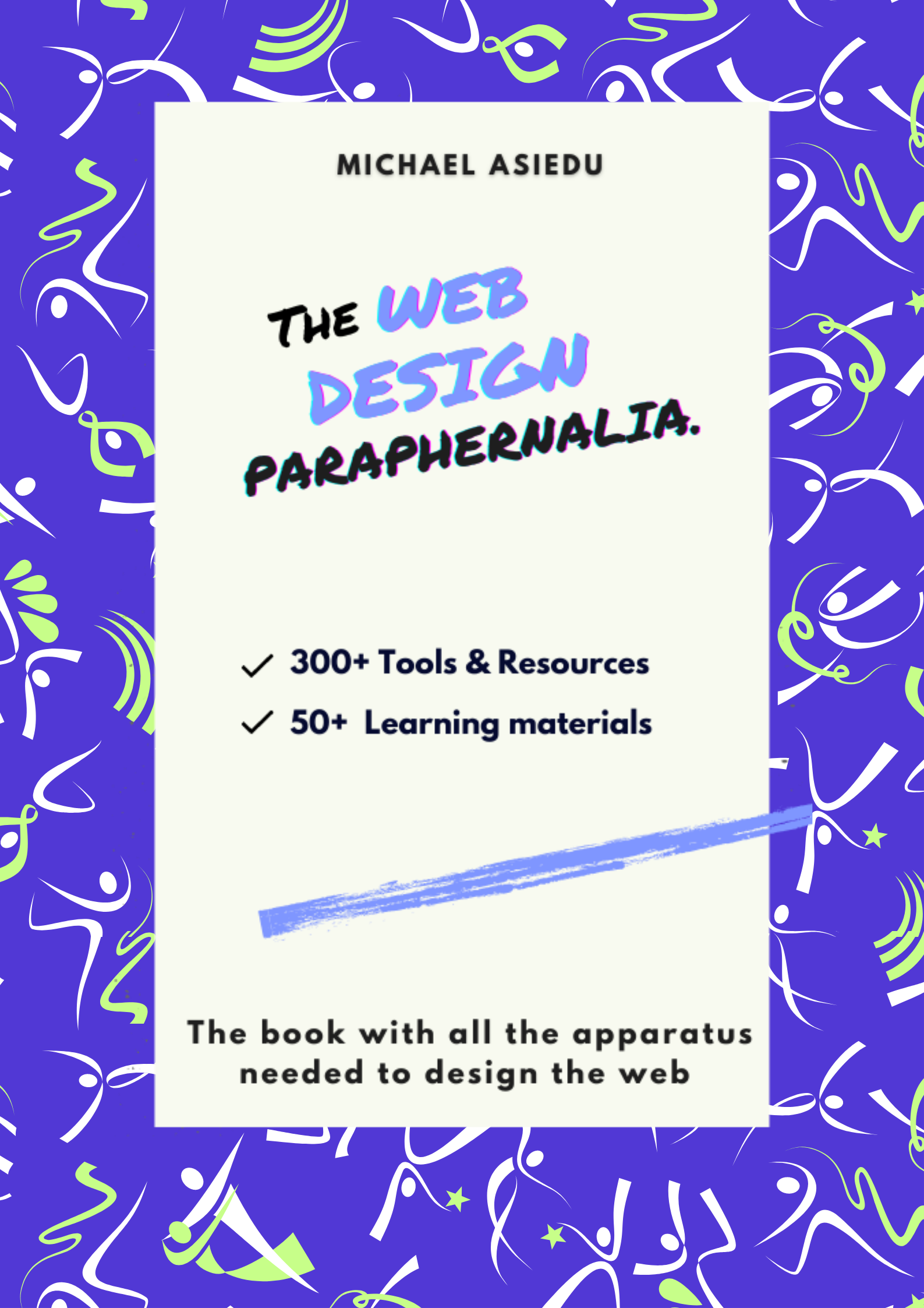
Get my FREE ebook, "The Web Design Paraphernalia," which provides all of the tools you'll need to start designing for the internet, here
Hundreds of tools and resources, including free learning materials from renowned institutions, leading articles, video courses, and YouTube channels, are yours for the taking.
I'm glad you found it interesting. Please accept my sincere gratitude for your time and attention. We'll see each other shortly.


